Hi Everyone!
Is there a definitive guide out there where one could compare the color of a rose in hand to a reference color. I mean color language that we rosarians use, not like a Pantone color reference.
Thanks!
Tony
Hi Everyone!
Is there a definitive guide out there where one could compare the color of a rose in hand to a reference color. I mean color language that we rosarians use, not like a Pantone color reference.
Thanks!
Tony
it’s not Pantone…
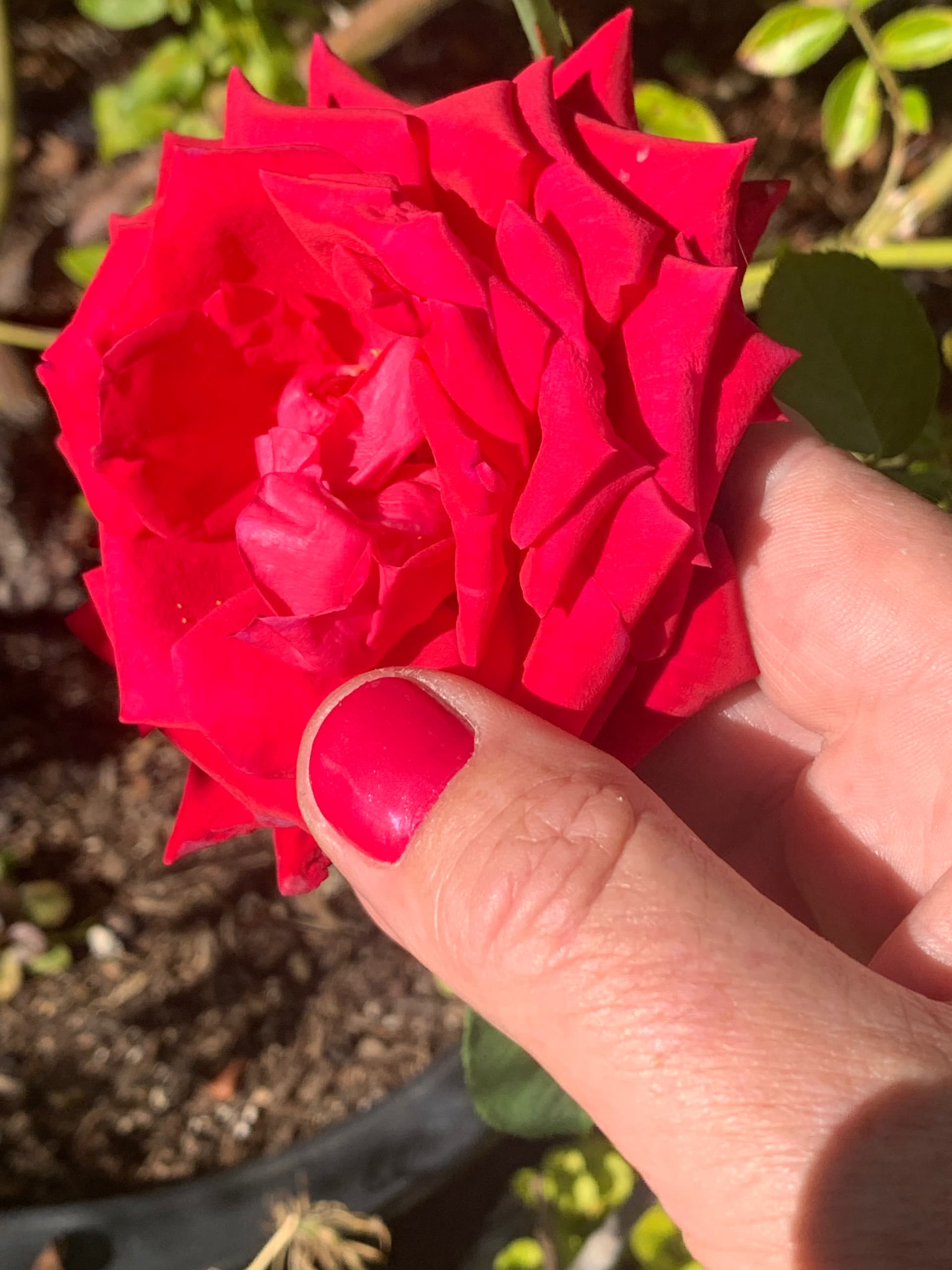
…but I referenced Miley Cyrus’ song Flowers at my very first mani/pedi ever, and this is me checking my nails (“cherry-red, just like the roses that you left”) against Karl Herbst.
Not helpful, I know. I couldn’t resist!
I remember this site tech guru and embryo surgeon released his somewhere in the past three decades. Kept it. I will check my lap top files (l am a 99.9% iphone user).
But not in my language eg either dark med or light red with undertones or whatever sees right. Mat gloss etc..
Still like opportunities to use burnt umber / sienna terms from my acrylic days for sunburned canes or natural - my Finn gallica x fedtschenlkonian cross.
Reds and yellows even more real names. I remember got a card for the acrylics. But few will relate. l am not aware of others.
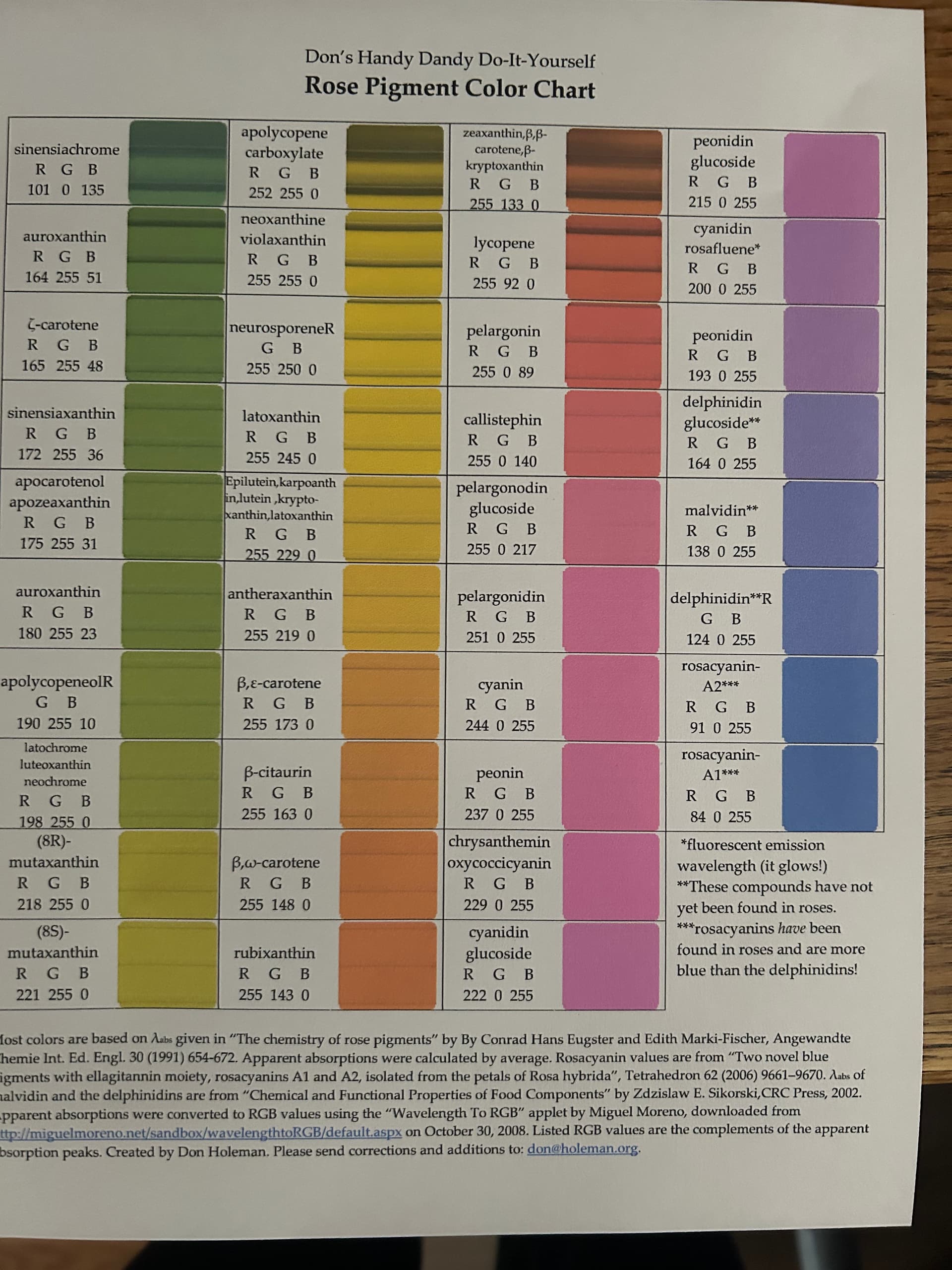
… found the table file … not what you want … has numbers for RGB
Named “Don’s Handy Dandy Do-It-Yourself Rose Pigment Color Chart” …
deep … goes over my head … should be in archives … may the force be with you or Don, or a knowledgeable buddy-buddy. Table form in adobe.
Below a cut example minus color example. In matrix form.
start of example …
sinensiachrome
R G B
101 0 135
apolycopene
carboxylate
R G B
252 255 0
zeaxanthin,β,β-
carotene,β-
kryptoxanthin
R G B
255 133 0
peonidin
glucoside
R G B
215 0 255
auroxanthin
R G B
164 255 51
neoxanthine
violaxanthin
R G B
255 255 0
lycopene
R G B
255 92 0
cyanidin
rosafluene*
R G B
200 0
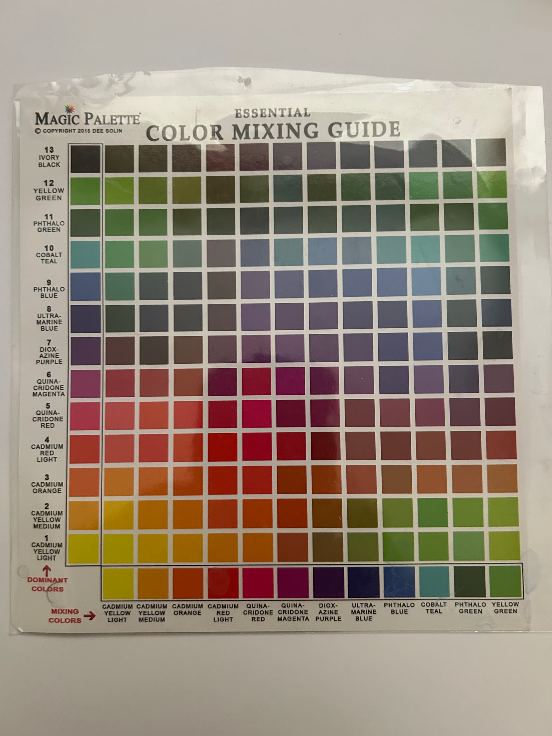
Now back in my van G sunflower days days l used this for painting … very sparingly until got what l wanted ….
But l see you may have received a more useable one for roses….
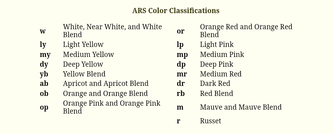
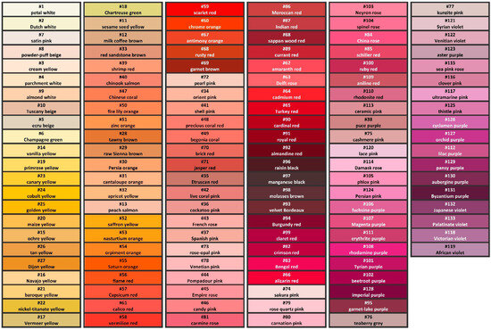
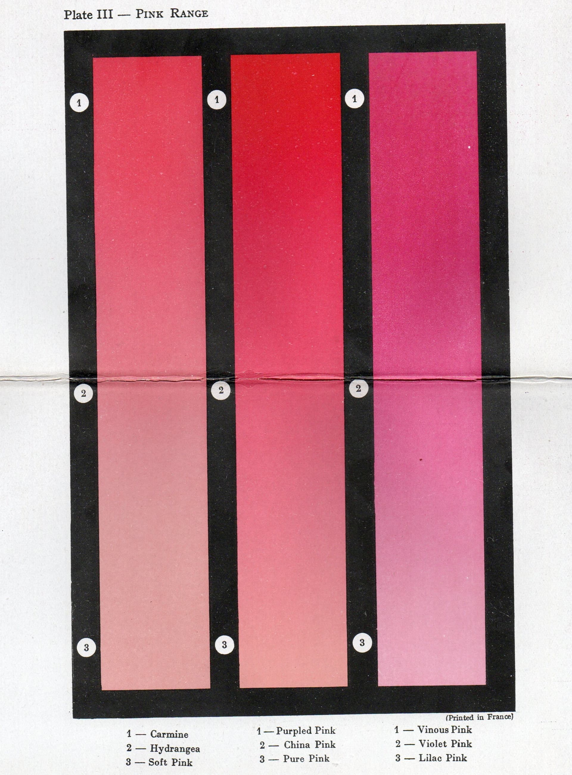
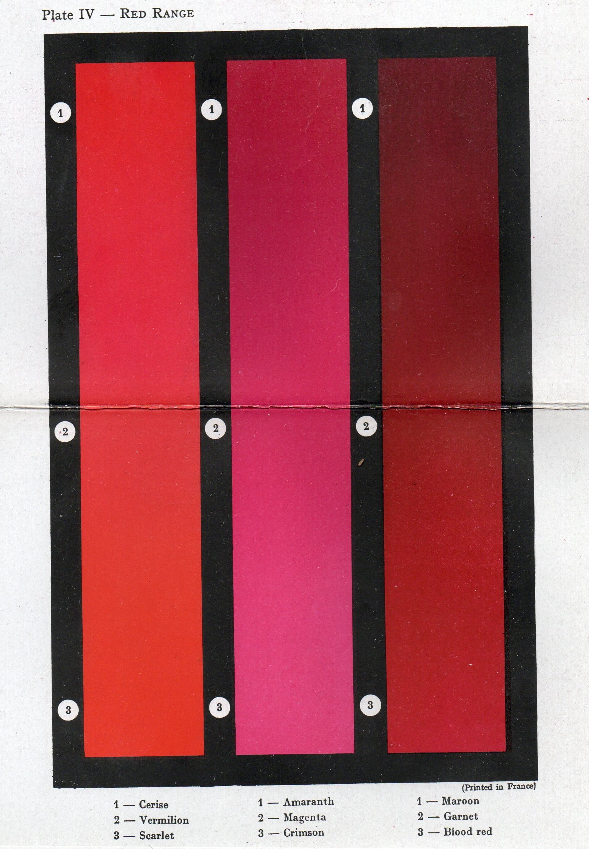
Apparently the ARS color system doesn’t seem to attach swatches of color to allow a user to easily compare with a rose. I could be wrong, just couldn’t find such a chart. Here are the color categories ( source ):
A study was published in 2024 addressing this lack, and proposed the following chart:
Humor is always helpful! ![]()
Thanks @RikuHelin! Yes, any time you can legitimately use burnt umber or burnt sienna it’s a treat! Or puce!
Tony
Thanks @SeasideRooftop! That’s an awesome study and resource!
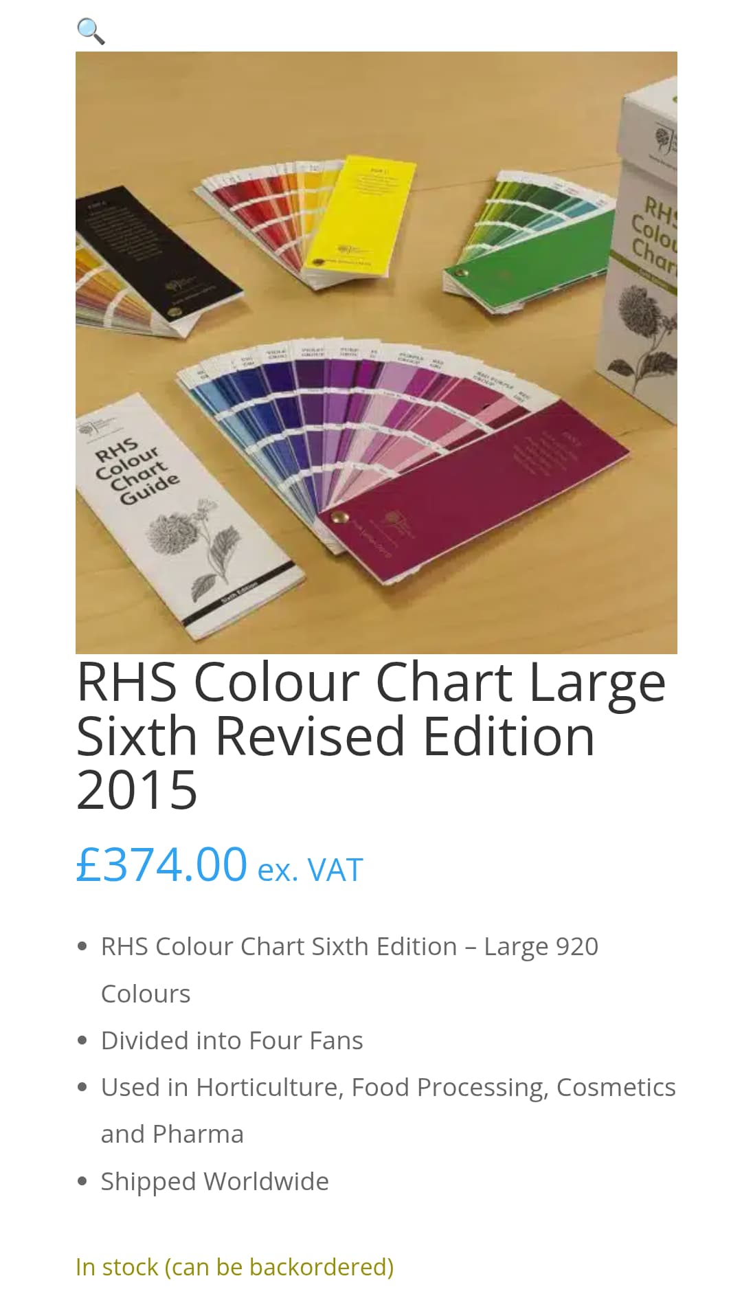
The most widely used horticultural standard these days would probably be the RHS Colour Chart; a new one tends to be published every few decades, but it isn’t cheap.
Stefan
Don’s chart is actually pretty cool, [edited to say it’s actually pretty awesome] though there is a certain irony in translating the spectra to RGB values. Our eyes might interpret colors based on RGB light (or CMY absorption of pigments) but our eyes have extreme limitations. That is what makes a spectral green look similar to (or be a “metamer" to) what might in fact be a blend of distinctly yellow and blue. (Metamerizating is, I believe, the term for a shift in perceived hues based on the absorption of different light spectra shone upon a particular item. So for instance a “blue-grey" paint hue made from lamp black and deep gold pigment might appear very different under blue sky than it will under warm incandescent lighting, relative to other hues surrounding it that might metamerize differently.)
I find it interesting that our ears can pick out the individual pitches from e.g. a chord, but our eyes reinterprate a blend of hues as one color.
I have recently been looking at pedigrees in hopes of divining, for instance, which of the vermillion-orange hues might in fact contain a yellow pigment in the genome rather than an orange. (Would that be flavonoid vs carotenoid?)
Does any one have any sense as to whether my thinking has merit? (The theories on color inheritance of over a century ago were pretty broad and seem to have extreme limitations imho.)
[quote=“MidAtlas, post:8, topic:14059”]
The most widely used horticultural standard these days would probably be the RHS Colour Chart; a new one tends to be published every few decades, but it isn’t cheap.
[/quote
]
£374???
How in the world are they charging that much for a color chart? Wow.
It’s likely because of the printing process to get accurate colour, much like the pantone one, likely every single colour is it’s own ink/dye/whatever and not a combination of CYMK that’s combined by the printer. It’d take a stupid amount of time to print a fairly low demand product, every “page” would run through 5 times with ink needing to be changed each run through kind of thing.
In 2015, they were charging £199.00 for it, so the price has increased somewhat sharply. For anyone looking at purchasing a used copy (if they can be gotten affordably), the 1986 edition apparently had problems with some of the colors.
I noticed that the RHS Colour Chart was no longer available shortly after Brexit. Before this date it could be purchased directly from the Royal Horticultural Society for £199.00. That’s right. The original RHS web page no longer exists. Now, only a few remaining copies of the chart seem to be available worldwide at highly increased prices. The last edition was revised in 2015. Normally, there would certainly be a new edition by now.
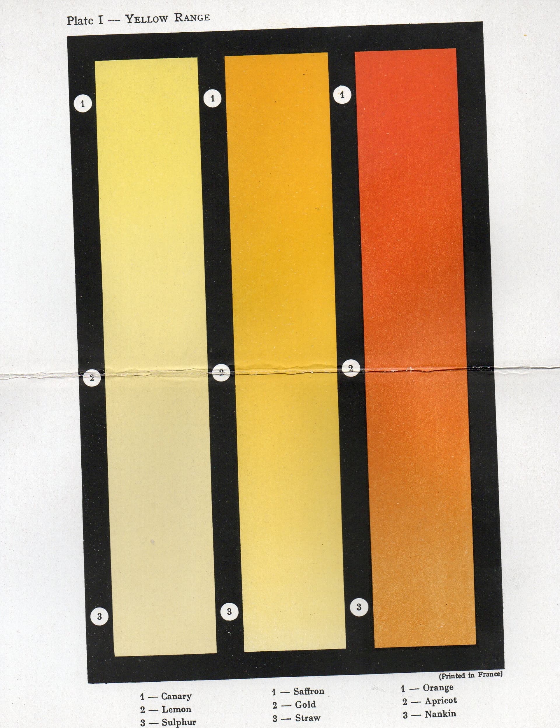
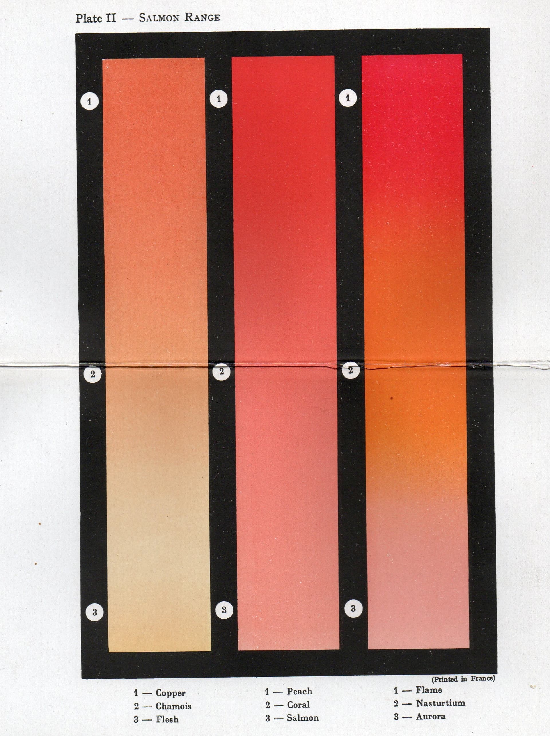
In my small rose book library, I found an old Color Chart from the book J. H. Nicolas. (1938) “The Rose Manual”. It is certainly somewhat antiquated, but perhaps it can still serve as a small guide.
Just looking in my email history, it was £208.33 in 2020 direct from RHS.
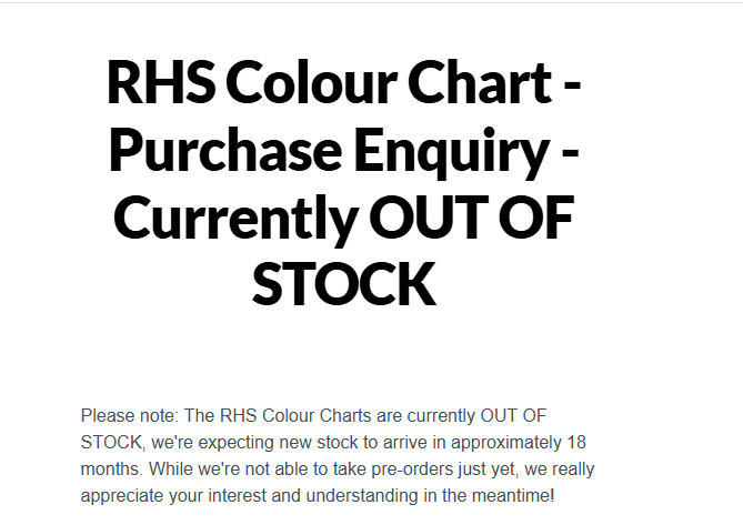
Just looking at the RHS site now and looks like the color chart is out of stock
searching the site leads to Search the RHS website for gardening knowledge / RHS which then leads to an outstock, sign up for notification of preorder thing (screenshot attached)
which may mean it’s a price hike from resellers (the 374 price seems it came from RHS Colour Chart Large Sixth Revised Edition 2015 - Labtek Services Ltd ) as the direct source doesn’t have stock.
Interesting stuff.
Now l remember why l dislike home damage and reno declarations time … pick a color from the chips and then try to match it 5 years later with the machine after kids put a hole in the wall. Can and color code long gone and HD color reader right about 70% - 80% of time. But never got pink stucco code wrong thanks to California market. Amazing what you can do with pinch of dusty rose oxide in a sea of white titanium dioxide. Interior? Learned to favour “contractor beige’ instead grape, strawberry etc hues variances.
Have to have the patience of a color hybridizer.
Long live the Louvre et al painted art restoration technician/ experts.
As to pitch, don’t know, l have this wonderful new tech for 3 weeks in my ears, now get to control what gets into the cpu.
@SeasideRooftop I just realized that the study you cited was Hungarian. Interesting to me because I’m 1/2 Hungarian.
Some very good responses and interesting and useful subject tables.