For those who may not have seen the article in the latest newsletter or the announcement in the RHA Facebook group:
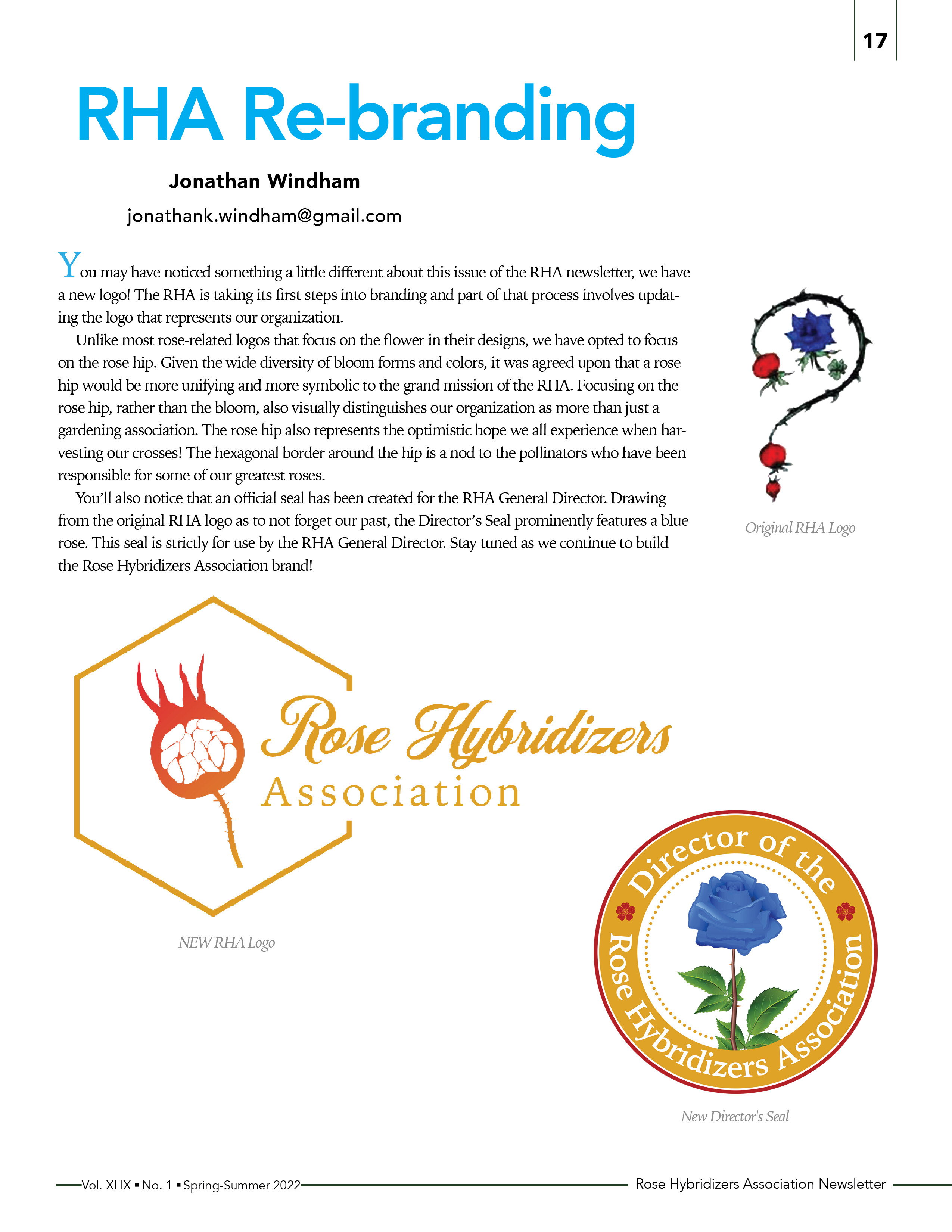
“You may have noticed something a little different about this issue of the RHA newsletter, we have a new logo! The RHA is taking its first steps into branding and part of that process involves updating the logo that represents our organization.
Unlike most rose-related logos that focus on the flower in their designs, we have opted to focus on the rose hip. Given the wide diversity of bloom forms and colors, it was agreed upon that a rose hip would be more unifying and more symbolic to the grand mission of the RHA. Focusing on the rose hip, rather than the bloom, also visually distinguishes our organization as more than just a gardening association. The rose hip also represents the optimistic hope we all experience when harvesting our crosses! The hexagonal border around the hip is a nod to the pollinators who have been responsible for some of our greatest roses.
You’ll also notice that an official seal has been created for the RHA General Director. Drawing from the original RHA logo as to not forget our past, the Director’s Seal prominently features a blue rose. This seal is strictly for use by the RHA General Director. Stay tuned as we continue to build the Rose Hybridizers Association brand!”